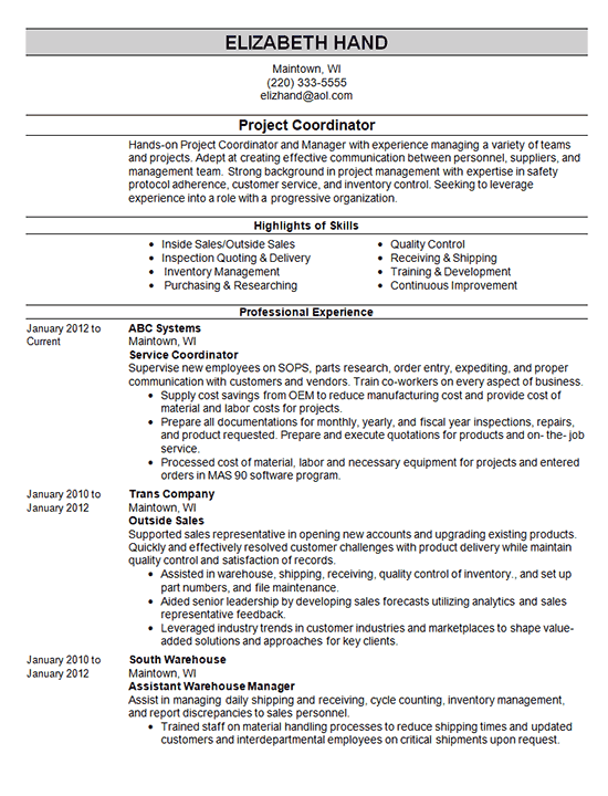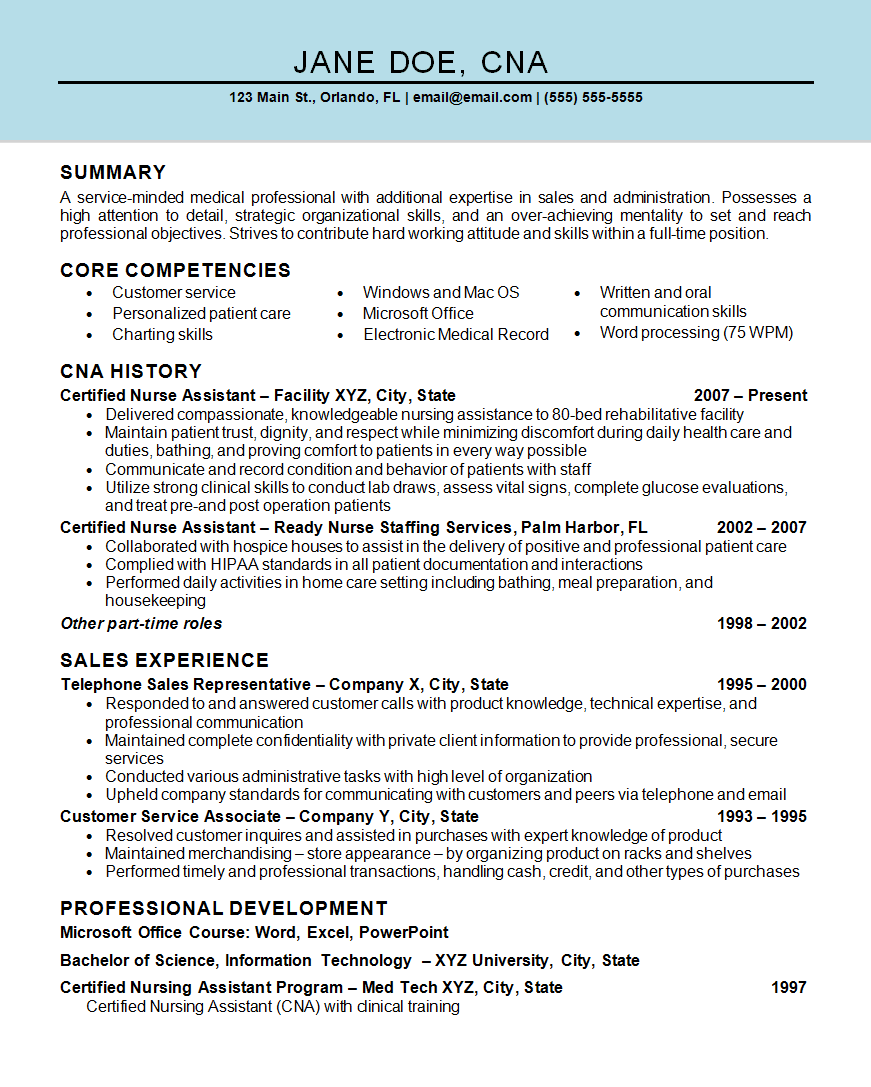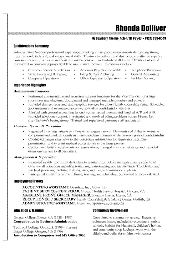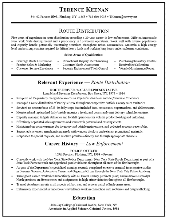
Resume Font Wars – Serif versus Sans-Serif
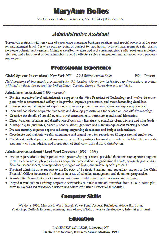
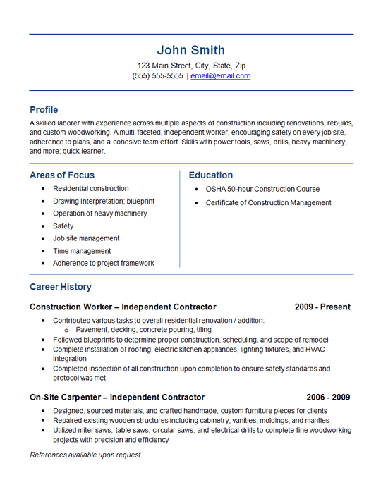
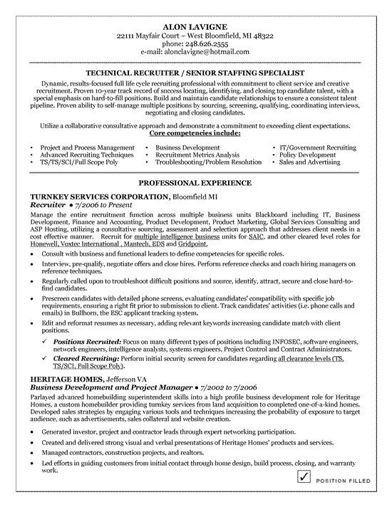
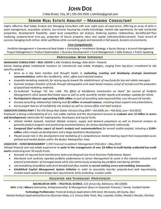
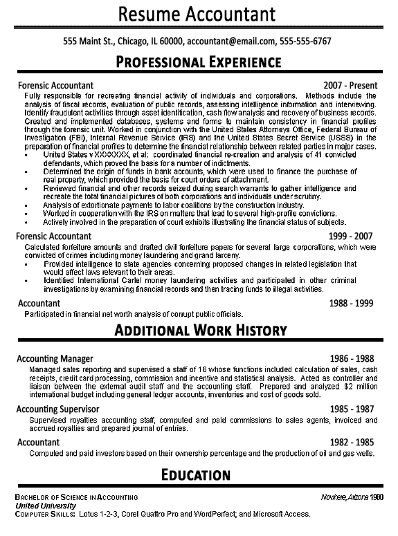
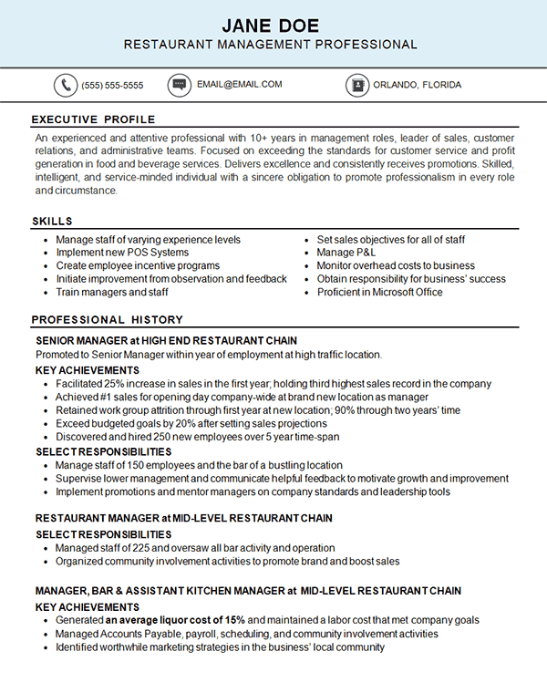
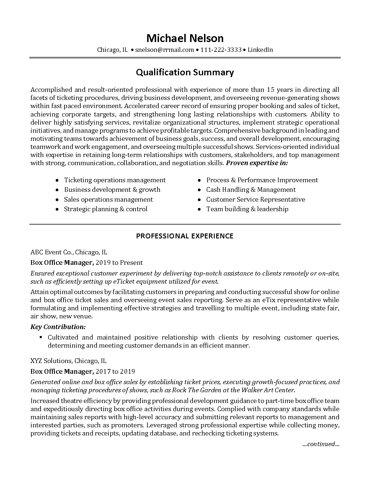
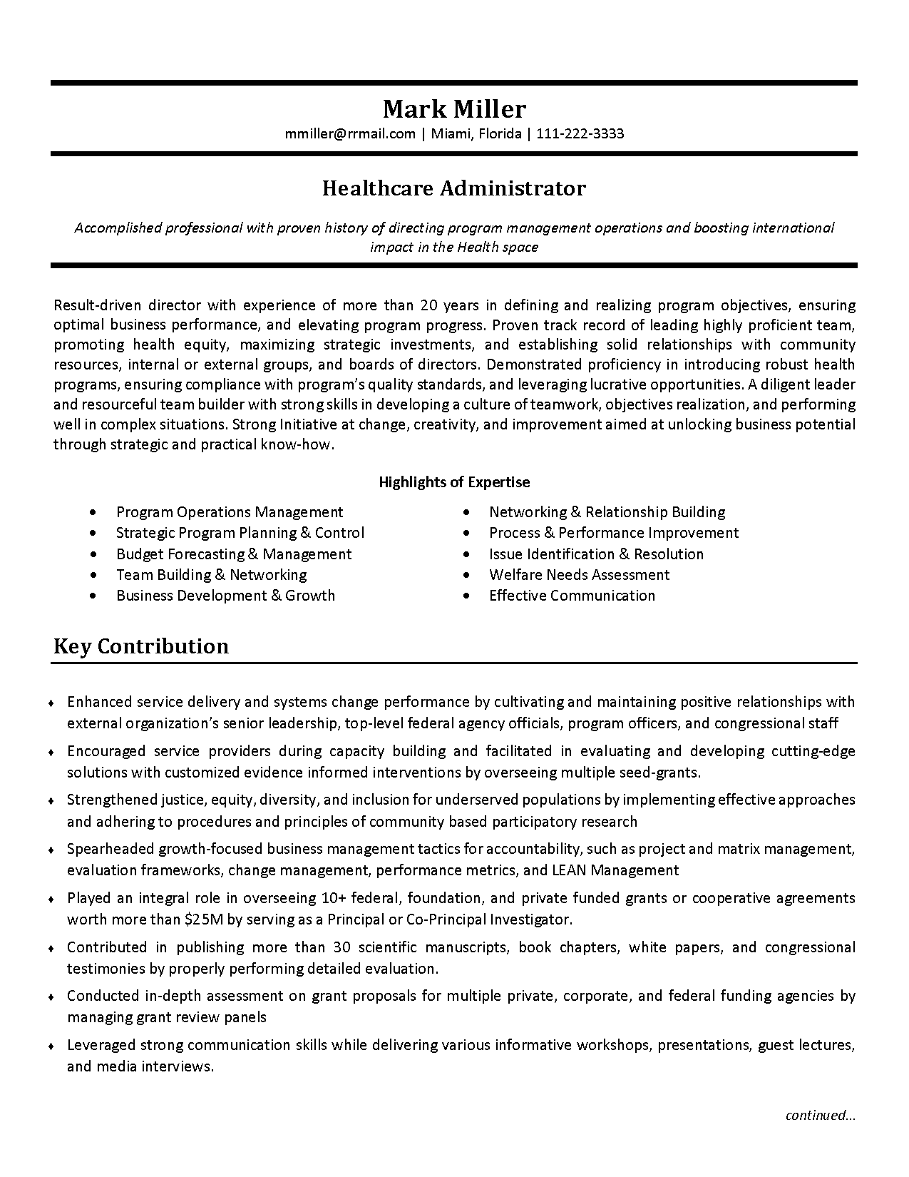
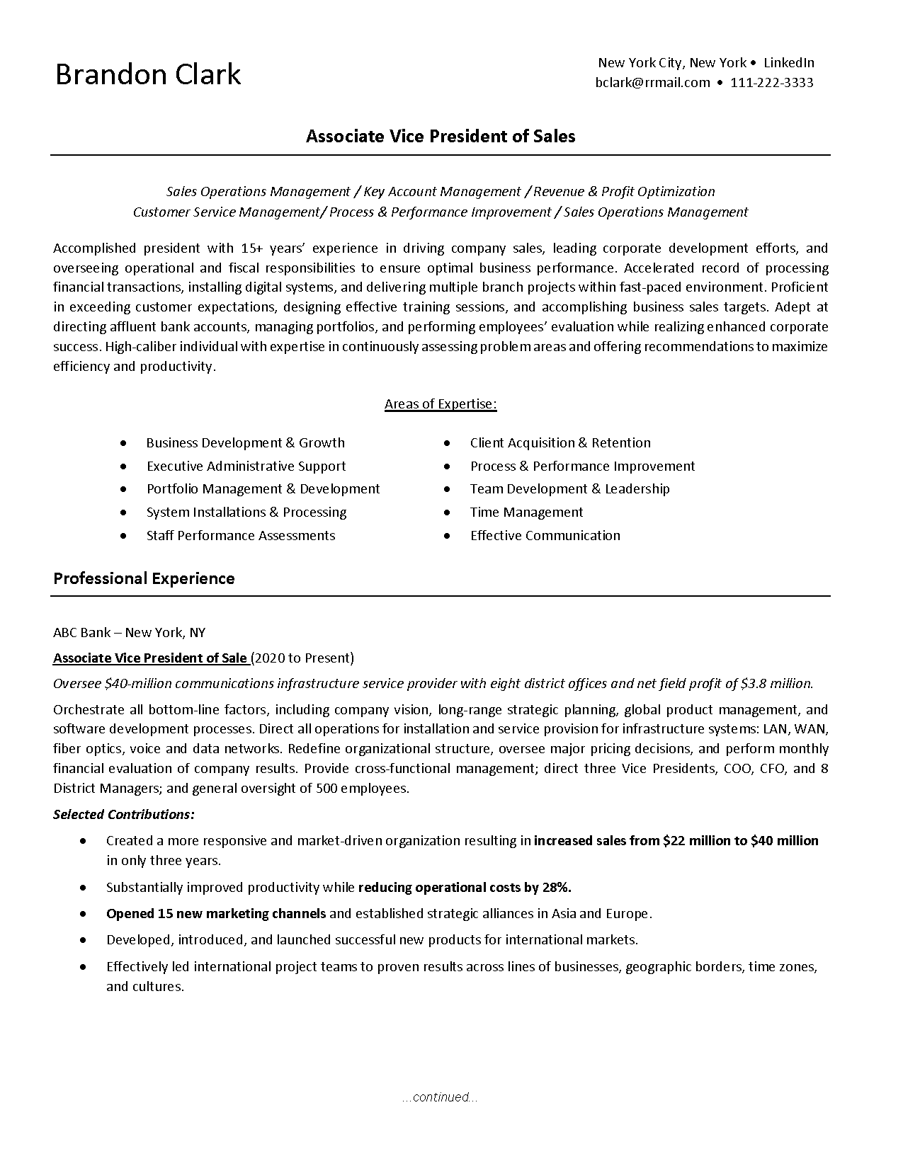
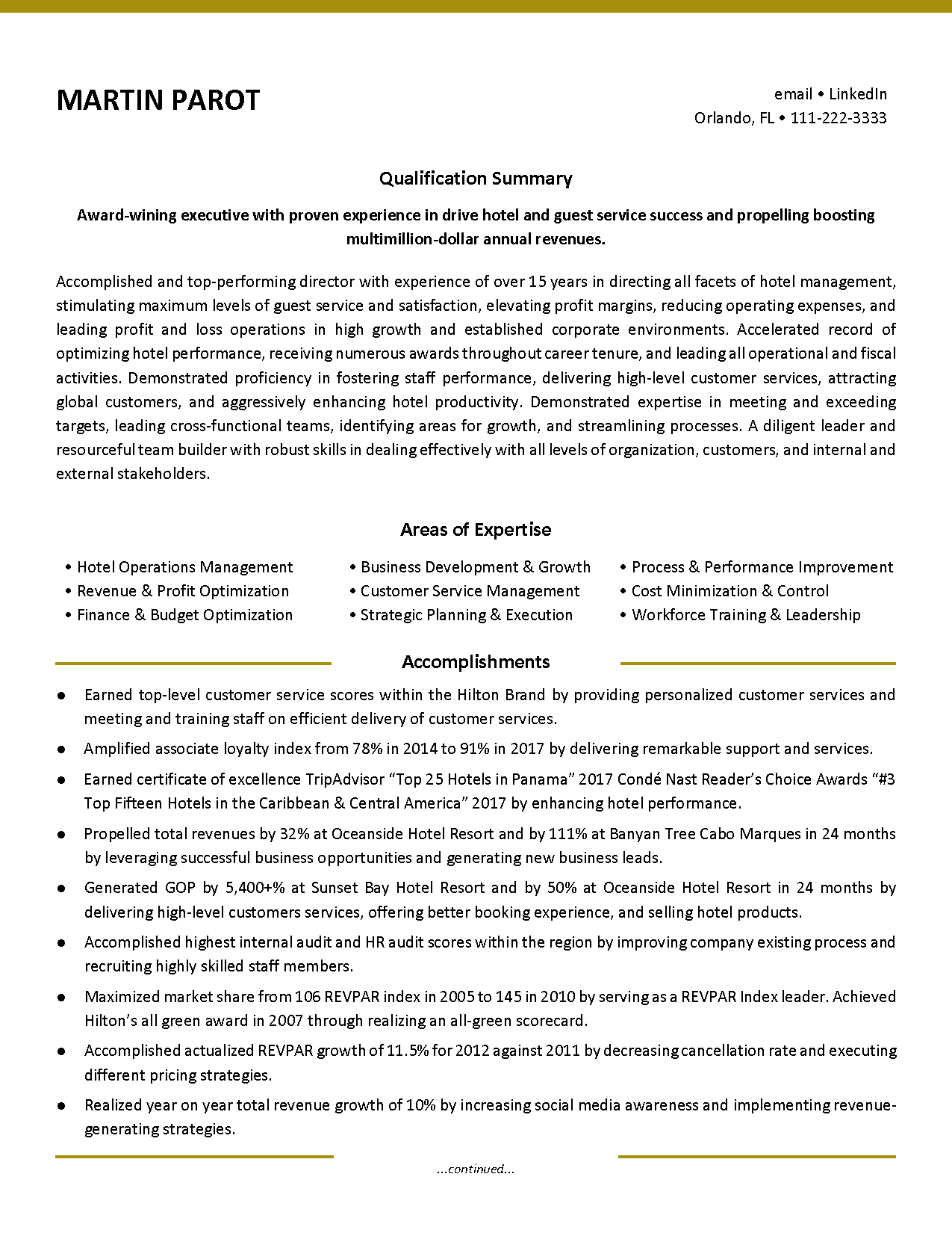
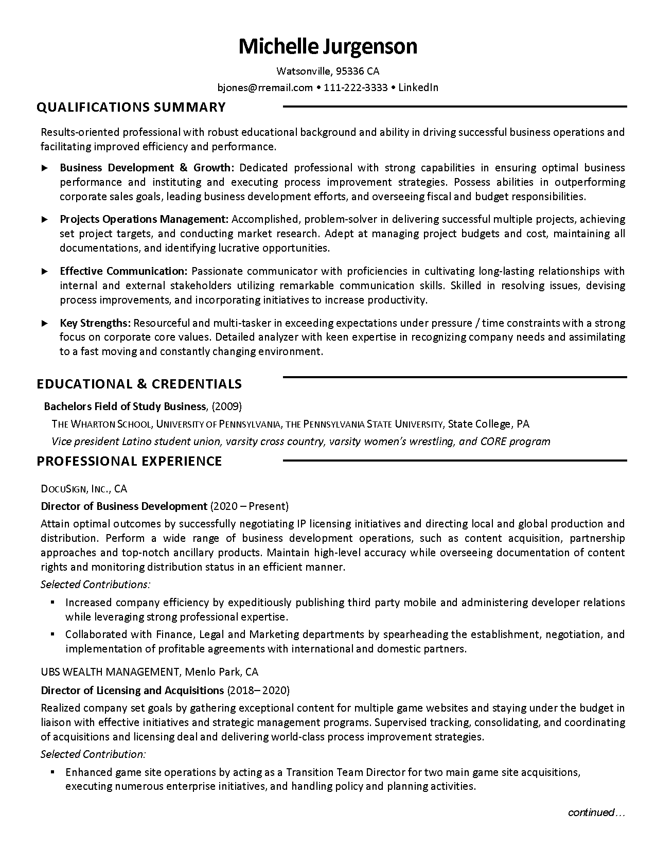
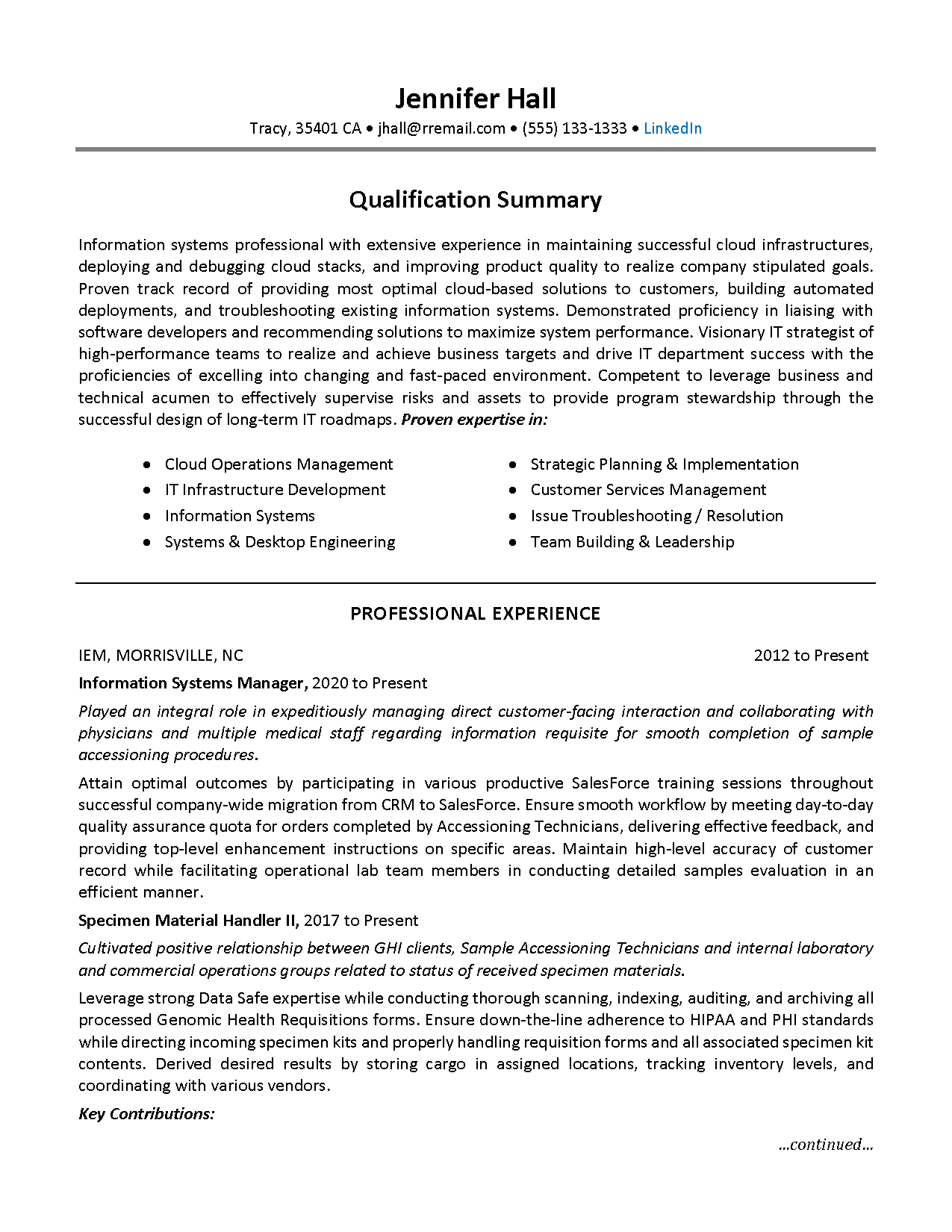
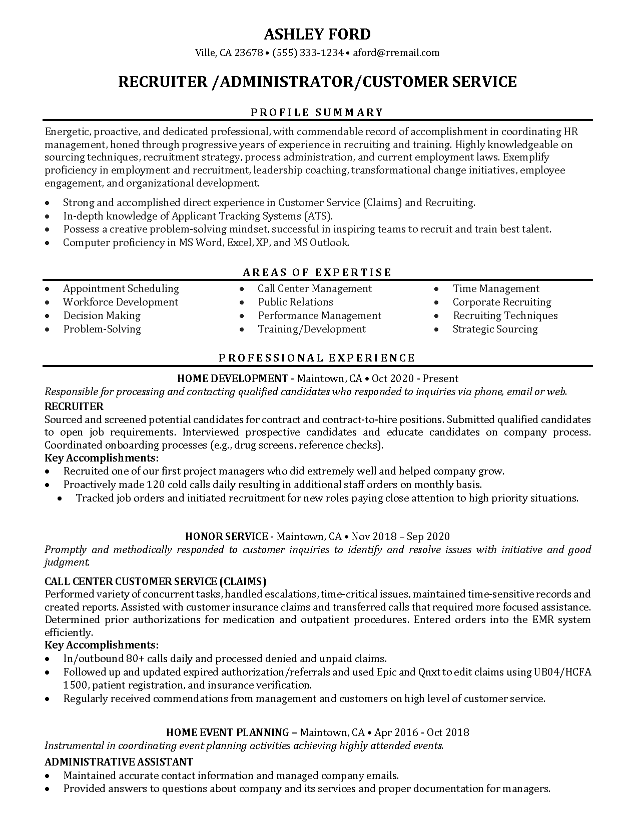
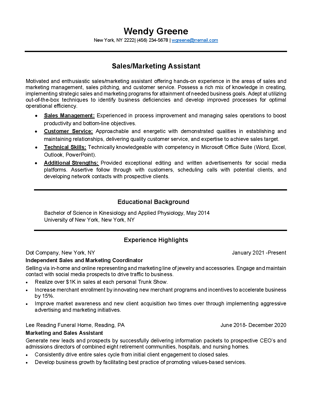
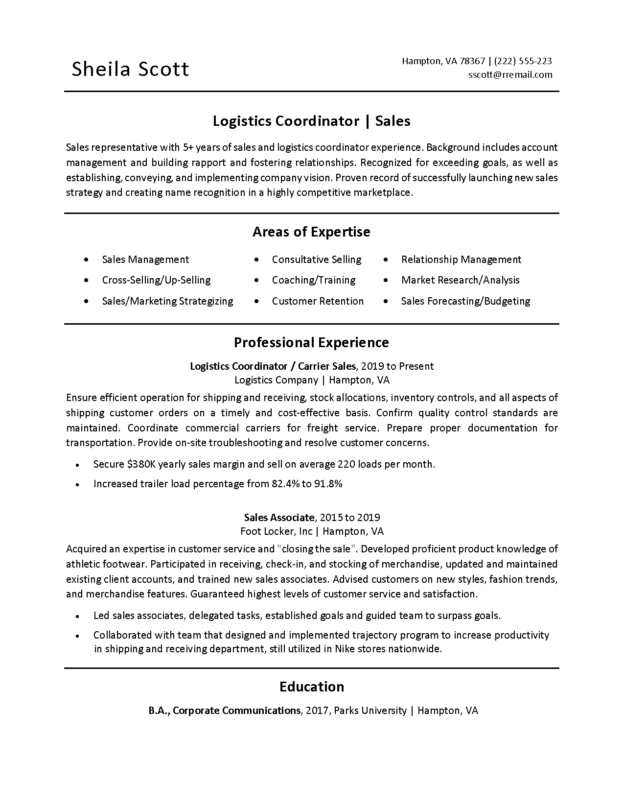
You might think that font selection is a minor detail when it comes to your new résumé. Font is only a minor detail if you get it right. Incorrect font selection can affect how easily and quickly your résumé will be read. A serif font (such as Times New Roman) has small tails from the edges of the letters. A sans-serif font does not have the tails projecting from the letters. Sans-serif fonts are cleaner fonts.
Resume Fonts – Is There a Standard?
For many years (maybe too many) Times New Roman was “the” résumé font. Times New Roman is a serif font. There are people who continue to profess Times New Roman is the résumé standard. However, if you look to modern résumé writing professionals, you will receive different advice. The prevalent advice today is to use a sans serif font. Why is this? Who and what determines what is best for your résumé? Read on to find the answers.
Screen and Paper Friendly
The real issue is not popularity or style. Choosing serif or sans serif is secondary to the issue of a font being highly-readable on paper and on a screen. In an effort to conserve resources, most people avoid printing documents as much as possible. Readers have immediate and near-constant access to laptop, tablet, and smart phone devices to make viewing and saving documents convenient. Therefore, almost all documents are viewed on a screen at some point. Many documents are never read on paper.
Analytical Approach to Font Selection
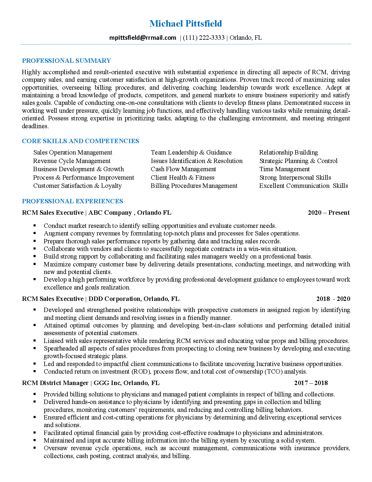
According to a Text Font Readability Study by Dr. Ralph Wilson, online “readers prefer sans serif fonts to serif fonts for body text.” Dr. Wilson suggested 12-point Arial and Verdana in 10- or 9-point font for online formats. At the time of his study the sans serif font, Calibri, was not yet created. Calibri is now the default font type in Word, PowerPoint, Excel, and Outlook, however, it is not considered a universal font. Universal fonts are those that are common and installed on most computers. Universal fonts include Arial, Arial Black, Comic Sans, Courier, Geneva, Georgia, Helvetica, Impact, Lucida, Lucida Sans, MS Sans Serif, MS Serif, Palatino, Symbol, Tahoma, Times New Roman, and Verdana. Despite the fact that Calibri is not universally available, it is widely available. Also, due to the fact that most people screening résumés use MS Word, Calibri is considered an appealing font choice for a résumé.
Fonts to Avoid
Older serif fonts include Times, Times New Roman, and Palatino – fonts that may look fuzzy on a low-resolution screen, tablet, or smart phone. Therefore, those fonts should not be used on your résumé. Older sans serif fonts, such as Arial, Geneva and Helvetica, are adequate choices. However, they are not as stylized and are therefore slightly inferior to more sophisticated san serif choices.
Excellent Font Choices
Modern sans serif fonts present a clean, sophisticated look. They are far easier on the eyes when presented on screen. There are a few choices that present well on screen and paper. Verdana (9-point), Calibri (11-point) and Trebuchet (10-point) look good on screen and paper. These fonts will look good when their size is reduced on a small screen and also across various platforms and browsers. These fonts are also acceptable by ATS (Applicant Tracking Systems). Verdana is a universal font. Calibri and Trebuchet are widely accepted.
So, who is the winner of the résumé font wars? Hands-down, the winner is sans serif. This is based on the fact that résumés are most often viewed on screen. Sans serif fonts are more easily read on screen, even tiny or low resolution screens. Not all sans serifs fonts are created equal. So, choose your font carefully with your reader in mind!


